Create
<Create> provides us a layout to display the page. It does not contain any logic but adds extra functionalities like action buttons and giving titles to the page.
We'll show what <Create> does using properties with examples.
You can swizzle this component to customize it with the refine CLI
Properties
title
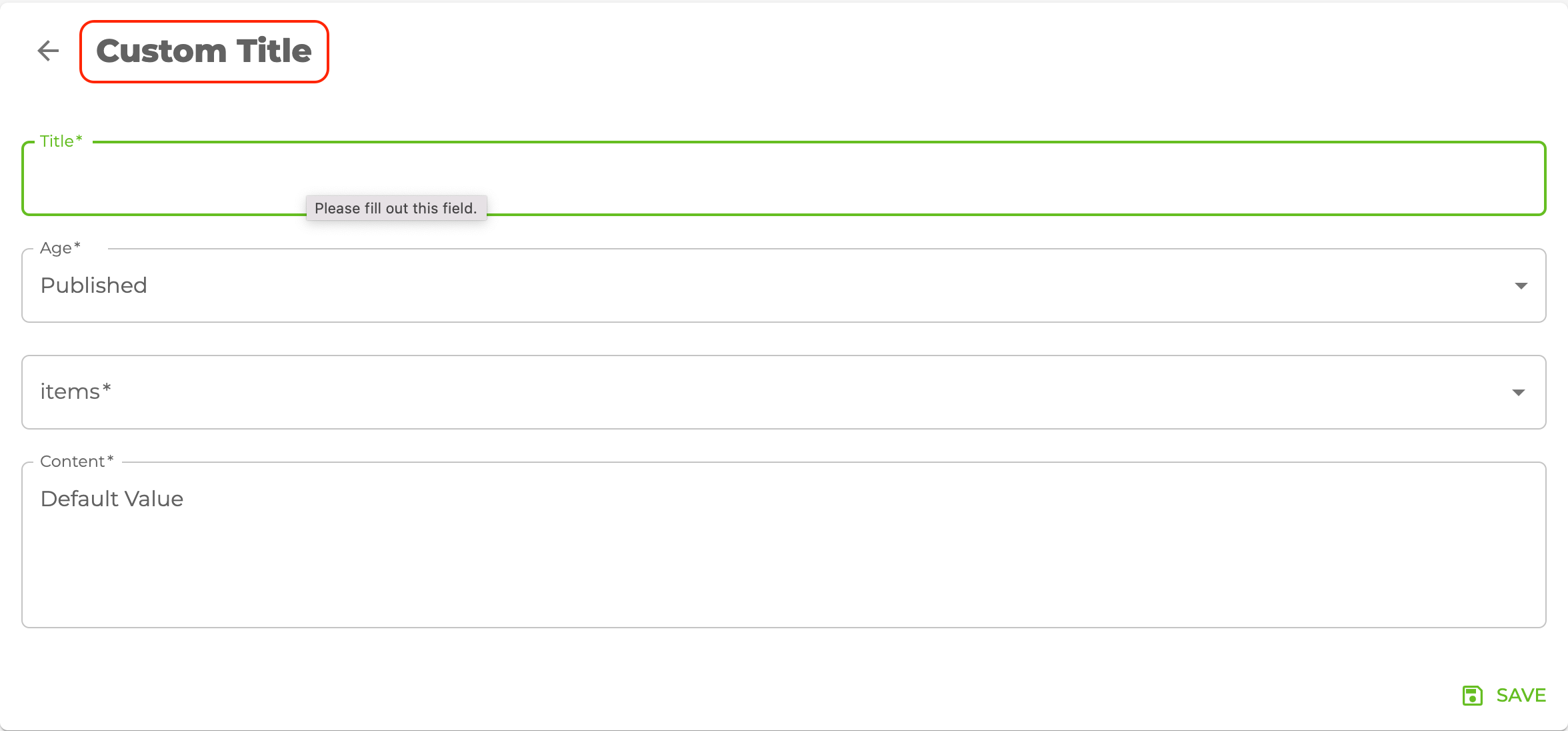
It allows adding title inside the <Create> component. if you don't pass title props it uses "Create" prefix and singular resource name by default. For example, for the /posts/create resource, it will be "Create post".
import { Create } from "@pankod/refine-mui";

export const CreatePage: React.FC = () => {
    return <Create title="Custom Title">...</Create>;
};
resource
The <Create> component reads the resource information from the route by default. This default behavior will not work on custom pages. If you want to use the <Create> component in a custom page, you can use the resource prop.
Refer to the custom pages documentation for detailed usage. →
import { Refine } from "@pankod/refine-core";
import { Create } from "@pankod/refine-mui";
import routerProvider from "@pankod/refine-react-router-v6";
import dataProvider from "@pankod/refine-simple-rest";

const CustomPage = () => {
    return <Create resource="posts">...</Create>;
};

export const App: React.FC = () => {
    return (
        <Refine
            routerProvider={{
                ...routerProvider,
                routes: [
                    {
                        element: <CustomPage />,
                        path: "/custom",
                    },
                ],
            }}
            dataProvider={dataProvider("https://api.fake-rest.refine.dev/")}
            resources={[{ name: "posts" }]}
        />
    );
};
saveButtonProps
<Create> component has a default button that submits the form. If you want to customize this button you can use the saveButtonProps property like the code below.
Refer to the <SaveButton> documentation for detailed usage. →
import { Create } from "@pankod/refine-mui";

export const CreatePage: React.FC = () => {
    return <Create saveButtonProps={{ size: "small" }}>...</Create>;
};
goBack
To customize the back button or to disable it, you can use the goBack property.
import { Create } from "@pankod/refine-mui";
import { useNavigation } from "@pankod/refine-core";
import { MyBackButton } from "@components";

export const CreatePage: React.FC = () => {
    const { goBack } = useNavigation();

    return (
        <Create
            /* ... */
            goBack={<MyBackButton onClick={() => goBack()} />}
            /* ... */
        >
            ...
        </Create>
    );
};
isLoading
To toggle the loading state of the <Create/> component, you can use the isLoading property.
import { Create } from "@pankod/refine-mui";

export const CreatePage: React.FC = () => {
    const [loading, setLoading] = React.useState(true);

    return (
        <Create
            /* ... */
            isLoading={loading}
            /* ... */
        >
            ...
        </Create>
    );
};
breadcrumb
To customize or disable the breadcrumb, you can use the breadcrumb property. By default it uses the Breadcrumb component from @pankod/refine-mui package.
Refer to the Breadcrumb documentation for detailed usage. →
This feature can be managed globally via the <Refine> component's options
import { Create } from "@pankod/refine-mui";

export const CreatePage: React.FC = () => {
    return (
        <Create
            /* ... */
            breadcrumb={null}
            /* ... */
        >
            ...
        </Create>
    );
};
wrapperProps
If you want to customize the wrapper of the <Create/> component, you can use the wrapperProps property.
Refer to the Card documentation from Material UI for detailed usage. →
import { Create } from "@pankod/refine-mui";

export const CreatePage: React.FC = () => {
    return (
        <Create
            /* ... */
            wrapperProps={{
                sx: {
                    backgroundColor: "snow",
                },
            }}
            /* ... */
        >
            ...
        </Create>
    );
};
headerProps
If you want to customize the header of the <Create/> component, you can use the headerProps property.
Refer to the CardHeader documentation from Material UI for detailed usage. →
import { Create } from "@pankod/refine-mui";

export const CreatePage: React.FC = () => {
    return (
        <Create
            /* ... */
            headerProps={{
                sx: {
                    backgroundColor: "snow",
                },
            }}
            /* ... */
        >
            ...
        </Create>
    );
};
contentProps
If you want to customize the content of the <Create/> component, you can use the contentProps property.
Refer to the CardContent documentation from Material UI for detailed usage. →
import { Create } from "@pankod/refine-mui";

export const CreatePage: React.FC = () => {
    return (
        <Create
            /* ... */
            contentProps={{
                sx: {
                    backgroundColor: "snow",
                },
            }}
            /* ... */
        >
            ...
        </Create>
    );
};
headerButtons
You can customize the buttons at the header by using the headerButtons property. It accepts React.ReactNode or a render function ({ defaultButtons }) => React.ReactNode which you can use to keep the existing buttons and add your own.
import { Create, Button } from "@pankod/refine-mui";

export const CreatePage: React.FC = () => {
    return (
        <Create
            /* ... */
            headerButtons={({ defaultButtons }) => (
                <>
                    {defaultButtons}
                    <Button type="primary">Custom Button</Button>
                </>
            )}
            /* ... */
        >
            ...
        </Create>
    );
};
headerButtonProps
You can customize the wrapper element of the buttons at the header by using the headerButtonProps property.
Refer to the Box documentation from Material UI for detailed usage. →
import { Create } from "@pankod/refine-mui";

export const CreatePage: React.FC = () => {
    return (
        <Create
            /* ... */
            headerButtonProps={{
                sx: {
                    backgroundColor: "snow",
                },
            }}
            /* ... */
        >
            ...
        </Create>
    );
};
footerButtons
You can customize the buttons at the footer by using the footerButtons property. It accepts React.ReactNode or a render function ({ defaultButtons }) => React.ReactNode which you can use to keep the existing buttons and add your own.
import { Create, Button } from "@pankod/refine-mui";

export const CreatePage: React.FC = () => {
    return (
        <Create
            /* ... */
            footerButtons={({ defaultButtons }) => (
                <>
                    {defaultButtons}
                    <Button type="primary">Custom Button</Button>
                </>
            )}
            /* ... */
        >
            ...
        </Create>
    );
};
footerButtonProps
You can customize the wrapper element of the buttons at the footer by using the footerButtonProps property.
Refer to the CardActions documentation from Material UI for detailed usage. →
import { Create } from "@pankod/refine-mui";

export const CreatePage: React.FC = () => {
    return (
        <Create
            /* ... */
            footerButtonProps={{
                sx: {
                    backgroundColor: "snow",
                },
            }}
            /* ... */
        >
            ...
        </Create>
    );
};
actionButtons
actionButtonsUse headerButtons or footerButtons instead.
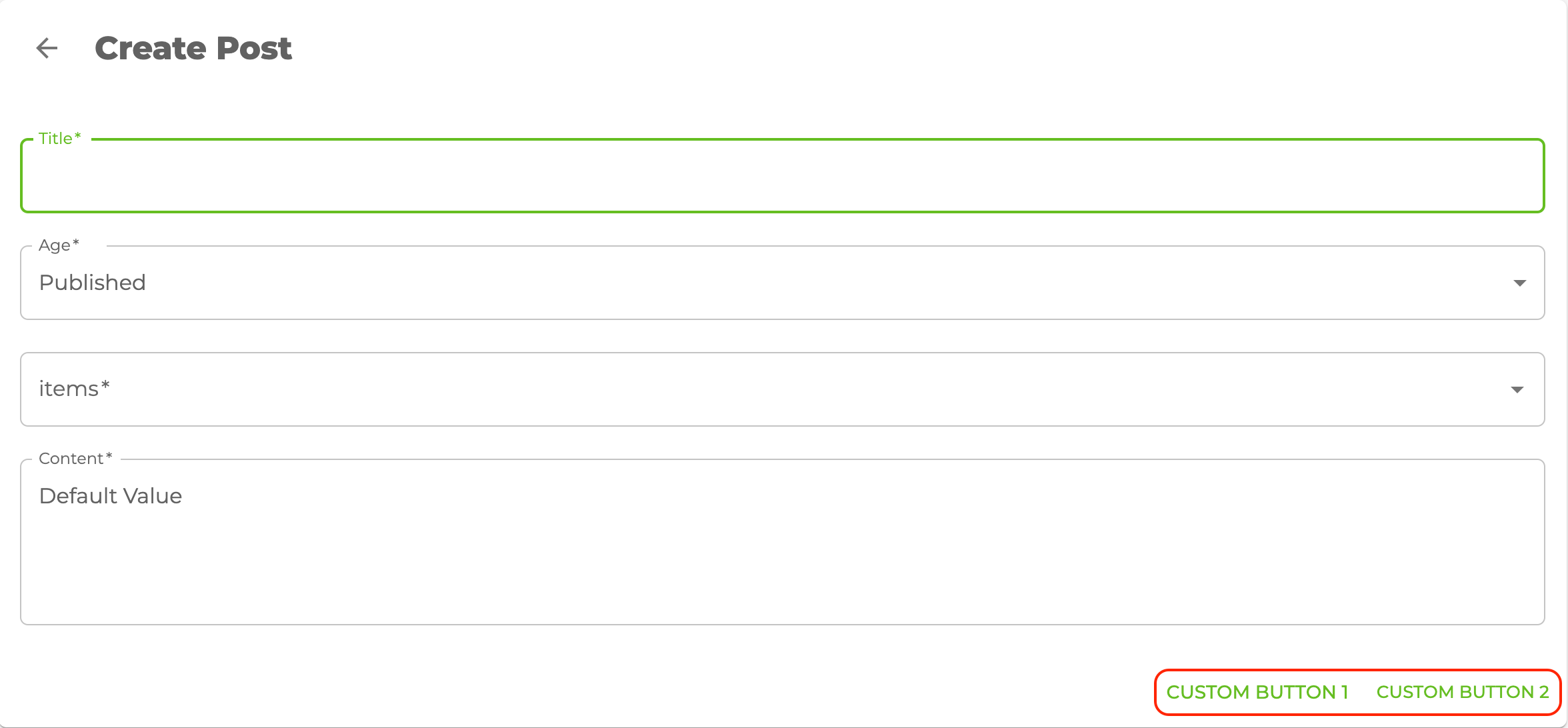
<Create> uses the Material UI <CardActions> component. The children of the <CardActions> component shows <SaveButton> and <DeleteButton> based on your resource definition in theresources property you pass to <Refine>. If you want to use other things instead of these buttons, you can use the actionButton property like the code below.
import { Create, Button } from "@pankod/refine-mui";

export const CreatePage: React.FC = () => {
    return (
        <Create
            actionButtons={
                <>
                    <Button>Custom Button 1</Button>
                    <Button>Custom Button 2</Button>
                </>
            }
        >
            ...
        </Create>
    );
};

cardProps
cardPropsUse wrapperProps instead.
<Create> uses the Material UI <Card> components so you can customize with the props of cardProps.
cardHeaderProps
cardHeaderPropsUse headerProps instead.
<Create> uses the Material UI <CardHeader> components so you can customize with the props of cardHeaderProps.
import { Create, Typography } from "@pankod/refine-mui";

export const CreatePage: React.FC = () => {
    return (
        <Create
            cardHeaderProps={{
                title: <Typography variant="h5">Custom Title</Typography>,
            }}
        >
            ...
        </Create>
    );
};

cardContentProps
cardContentPropsUse contentProps instead.
<Create> uses the Material UI <CardContent> components so you can customize with the props of cardContentProps.
cardActionsProps
cardActionsPropsUse headerButtonProps and footerButtonProps instead.
<Create> uses the Material UI <CardActions> components so you can customize with the props of cardActionsProps.