List
<List> provides us a layout to display the page. It does not contain any logic but adds extra functionalities like a create button or giving the page titles.
We will show what <List> does using properties with examples.
You can swizzle this component to customize it with the refine CLI
Properties
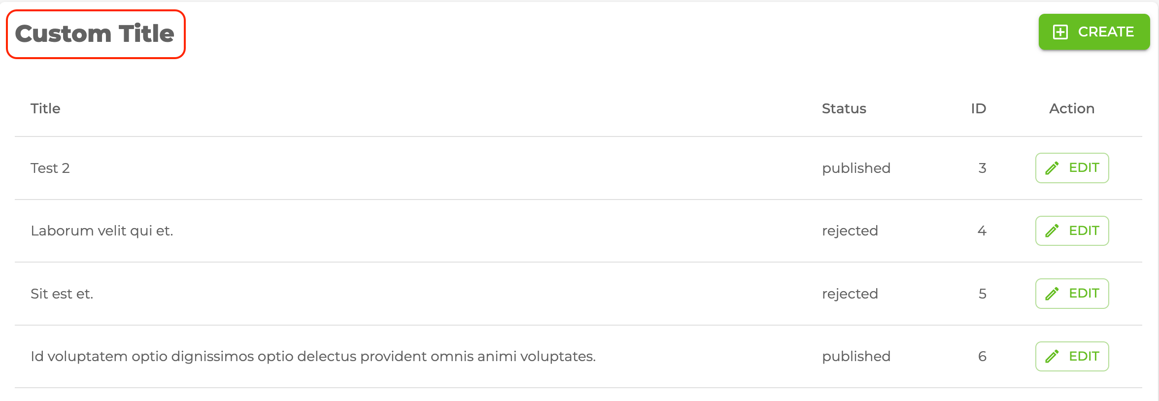
title
It allows adding title inside the <List> component. if you don't pass title props it uses the plural resource name by default. For example, for the /posts resource, it will be "Posts".
import { List } from "@pankod/refine-mui";

export const ListPage: React.FC = () => {
    return <List title="Custom Title">...</List>;
};
resource
The <List> component reads the resource information from the route by default. This default behavior will not work on custom pages. If you want to use the <List> component in a custom page, you can use the resource prop.
Refer to the custom pages documentation for detailed usage. →
import { Refine } from "@pankod/refine-core";
import { List } from "@pankod/refine-mui";
import routerProvider from "@pankod/refine-react-router-v6";
import dataProvider from "@pankod/refine-simple-rest";

const CustomPage = () => {
    return <List resource="posts">...</List>;
};

export const App: React.FC = () => {
    return (
        <Refine
            routerProvider={{
                ...routerProvider,
                routes: [
                    {
                        element: <CustomPage />,
                        path: "/custom",
                    },
                ],
            }}
            dataProvider={dataProvider("https://api.fake-rest.refine.dev/")}
            resources={[{ name: "posts" }]}
        />
    );
};
canCreate and createButtonProps
canCreate allows us to add the create button inside the <List> component. If resource is passed a create component, refine adds the create button by default. If you want to customize this button you can use createButtonProps property like the code below.
Create button redirects to the create page of the resource according to the value it reads from the URL.
import { usePermissions } from "@pankod/refine-core";
import { List } from "@pankod/refine-mui";

export const ListPage: React.FC = () => {
    const { data } = usePermissions<string>();

    return (
        <List
            canCreate={data === "admin"}
            createButtonProps={{ size: "small" }}
        >
            ...
        </List>
    );
};
Refer to the usePermission documentation for detailed usage. →
breadcrumb
To customize or disable the breadcrumb, you can use the breadcrumb property. By default it uses the Breadcrumb component from @pankod/refine-mui package.
Refer to the Breadcrumb documentation for detailed usage. →
This feature can be managed globally via the <Refine> component's options
import { List } from "@pankod/refine-mui";

export const ListPage: React.FC = () => {
    return (
        <List
            /* ... */
            breadcrumb={null}
            /* ... */
        >
            ...
        </List>
    );
};
wrapperProps
If you want to customize the wrapper of the <List/> component, you can use the wrapperProps property.
Refer to the Card documentation from Material UI for detailed usage. →
import { List } from "@pankod/refine-mui";

export const ListPage: React.FC = () => {
    return (
        <List
            /* ... */
            wrapperProps={{
                sx: {
                    backgroundColor: "snow",
                },
            }}
            /* ... */
        >
            ...
        </List>
    );
};
headerProps
If you want to customize the header of the <List/> component, you can use the headerProps property.
Refer to the CardHeader documentation from Material UI for detailed usage. →
import { List } from "@pankod/refine-mui";

export const ListPage: React.FC = () => {
    return (
        <List
            /* ... */
            headerProps={{
                sx: {
                    backgroundColor: "snow",
                },
            }}
            /* ... */
        >
            ...
        </List>
    );
};
contentProps
If you want to customize the content of the <List/> component, you can use the contentProps property.
Refer to the CardContent documentation from Material UI for detailed usage. →
import { List } from "@pankod/refine-mui";

export const ListPage: React.FC = () => {
    return (
        <List
            /* ... */
            contentProps={{
                sx: {
                    backgroundColor: "snow",
                },
            }}
            /* ... */
        >
            ...
        </List>
    );
};
headerButtons
You can customize the buttons at the header by using the headerButtons property. It accepts React.ReactNode or a render function ({ defaultButtons }) => React.ReactNode which you can use to keep the existing buttons and add your own.
import { List, Button } from "@pankod/refine-mui";

export const ListPage: React.FC = () => {
    return (
        <List
            /* ... */
            headerButtons={({ defaultButtons }) => (
                <>
                    {defaultButtons}
                    <Button type="primary">Custom Button</Button>
                </>
            )}
            /* ... */
        >
            ...
        </List>
    );
};
headerButtonProps
You can customize the wrapper element of the buttons at the header by using the headerButtonProps property.
Refer to the Box documentation from Material UI for detailed usage. →
import { List } from "@pankod/refine-mui";

export const ListPage: React.FC = () => {
    return (
        <List
            /* ... */
            headerButtonProps={{
                sx: {
                    backgroundColor: "snow",
                },
            }}
            /* ... */
        >
            ...
        </List>
    );
};
cardProps
cardPropsUse wrapperProps instead.
<List> uses the Material UI <Card> components so you can customize with the props of cardProps.
cardHeaderProps
cardHeaderPropsUse headerProps instead.
<List> uses the Material UI <CardHeader> components so you can customize with the props of cardHeaderProps.
import { List, Typography } from "@pankod/refine-mui";

export const CreatePage: React.FC = () => {
    return (
        <List
            cardHeaderProps={{
                title: <Typography variant="h5">Custom Title</Typography>,
            }}
        >
            ...
        </List>
    );
};
cardContentProps
cardContentPropsUse contentProps instead.
<List> uses the Material UI <CardContent> components so you can customize with the props of cardContentProps.